Toolkit, Art History
Art History Methods
LINE
The visible path of a point moving through space or the edge where two shapes meet
We think of line as having direction, weight, and even speed. Horizontal lines generally indicate stability, rest, tranquility; vertical lines indicate formality, alertness, and significantly affect our understanding of balance in the image; diagonal or oblique lines dramatically direct our gaze, and suggest movement, energy, action.
Shape
COLOR
COMPOSITION. Qell, now that's a long conversation. For now, I'll just leave it here: artists make choices about how to position and deploy the elements to make/compose their works. Consciously and subconsciously, the principles guide their decisions about how to use the elements to make pleasing or otherwise affecting works.
Biography
Context (including function/purpose--ie was it art, when it was made? and what would that even mean?)
Iconography
Critical Theory (social structures and pressures impacting an era and/or individual)
Formal Analysis
Gestalt
Formal Analysis Intro
What is the thing?
Sculpture:
- Freestanding Sculpture
- Sculpture in-the-round
- Relief (high relief and low relief (also called bas relief))
- Modeling
- Carving
- Casting
- Armature
- portable objects
- functional objects
Architecture
- Form
- Site
- Purpose
- Change over time
Painting & Photography-- terms will arise as we study
Time-Based Art- video, sound, performance....
Site-Specific, Installation, Land Art.....
Intro to Elements and Principles of Composition
" The elements of design are the physical parts of the artwork, or the form. The principles of design are the ways in which those parts are arranged or used, or the composition." (Pamela Sachant)
Design
Elements: line, shape or form, mass/volume, value, color, texture and space, positive space, negative space, perspective, color temperature, primary, secondary, complementary color
Principles: scale, proportion,movement, repetition and variety, balance, emphasis and harmony or unity
ELEMENTS
Most Basically, the Elements of Design, or Elements of Art, are the bits and pieces you use when you compose a work of two- or three-dimensional art. Most of these building blocks apply directly or indirectly to other visual art media like digital art, performance art, and video... and can add nuance to your interpretation of happenings and sound art as well. On the surface, you'll find these terms elementary... many degrees of sophistication can emerge through close reading of images with regards to their use of these basic elements.LINE
The visible path of a point moving through space or the edge where two shapes meet
We think of line as having direction, weight, and even speed. Horizontal lines generally indicate stability, rest, tranquility; vertical lines indicate formality, alertness, and significantly affect our understanding of balance in the image; diagonal or oblique lines dramatically direct our gaze, and suggest movement, energy, action.
 |
| Brice Marden, Vine. 1991-93. Oil on linen, 96 x 102 1/2" (243.8 x 260.3 cm) image credit MOMA |
 |
Robert Smithson, Spiral Jetty, 1970, Great Salt Lake, photographer unknown
|
 |
| Vilhelm Hammershoi,Gentoft Lake, 1905, oil, photocredit artandperception.com |
Shape
Most literally, a shape is a geometric or organic self-contained area. Usually, we perceive shape as two-dimensional. As you consider paintings, consider positive and negative shapes. When we talk about sculpture, we generally consider them through photographs, which can flatten forms to create shapes that allow us to see the sculptures differently.
 |
Paul Cézanne, Mont Saint Victoire, 1895. photocredit wiki paintings.
"Treat nature in terms of the cylinder, the sphere, and the cone, the whole put into perspective so that each side of an object, or of a plane, leads towards a central point. Lines parallel to the horizon give breadth, whether a sections of nature, or, if you prefer, of the spectacle which Pater omnipotens aeterne Deus unfolds before your eyes. Lines perpendicular to this horizon give depth.. ..Everything I am telling you ] about - the sphere, the cone, cylinder, concave shadow – on mornings when I’m tired these notions of mine get me going, they stimulate me, I soon forget them once I start using my eyes. (from wikiquotes, quoted from Joachim Gasquet’s Cézanne, - a Memoir with Conversations, Thames and Hudson, London 1991 pp. 163-164)
|
FORM
Many see form as a subset of shape or the same, even, and they can prove hard to tease apart. We speak of form as having depth as well as length and width, and perceive it as three-dimensional even in a flat work of art.
 |
| Paul Cézanne, Apples and Oranges, 1895-1900 |
 |
| Moyo Ogundipe, Soliloquy, Life's Fragile Fictions, 1997 acrylic on canvas (Think about Figure/Ground here) |
 |
| Pablo Picasso, Self Portrait at 15, 1896 |
also called hue. Whatever the hue, colors come from black, white, and the three primaries and vary in intensity and value. Valuable primers on color here and far more in depth and quite valuable resource from the ever-dependable OWL at Purdue, here. Color VALUE refers to how light or dark a color appears and color INTENSITY refers to how pure the saturation of the HUE. So, for example, a blue with absolutely no yellow or red added has a high intensity, a blue diluted with yellow that makes it head close to green has low intensity.
 |
| Vincent Van Gogh, Sorrowing Old Man (At Eternity's Gate) 1890 "It seems to me that a painter has a duty to try to put an idea into his work. I was trying to say this in this print — but I can’t say it as beautifully, as strikingly as reality, of which this is only a dim reflection seen in a dark mirror — that it seems to me that one of the strongest pieces of evidence for the existence of 'something on high' in which Millet believed, namely in the existence of a God and an eternity, is the unutterably moving quality that there can be in the expression of an old man like that, without his being aware of it perhaps, as he sits so quietly in the corner of his hearth. At the same time something precious, something noble, that can’t be meant for the worms. ... This is far from all theology — simply the fact that the poorest woodcutter, heath farmer or miner can have moments of emotion and mood that give him a sense of an eternal home that he is close to." image and quotation wikipedia |
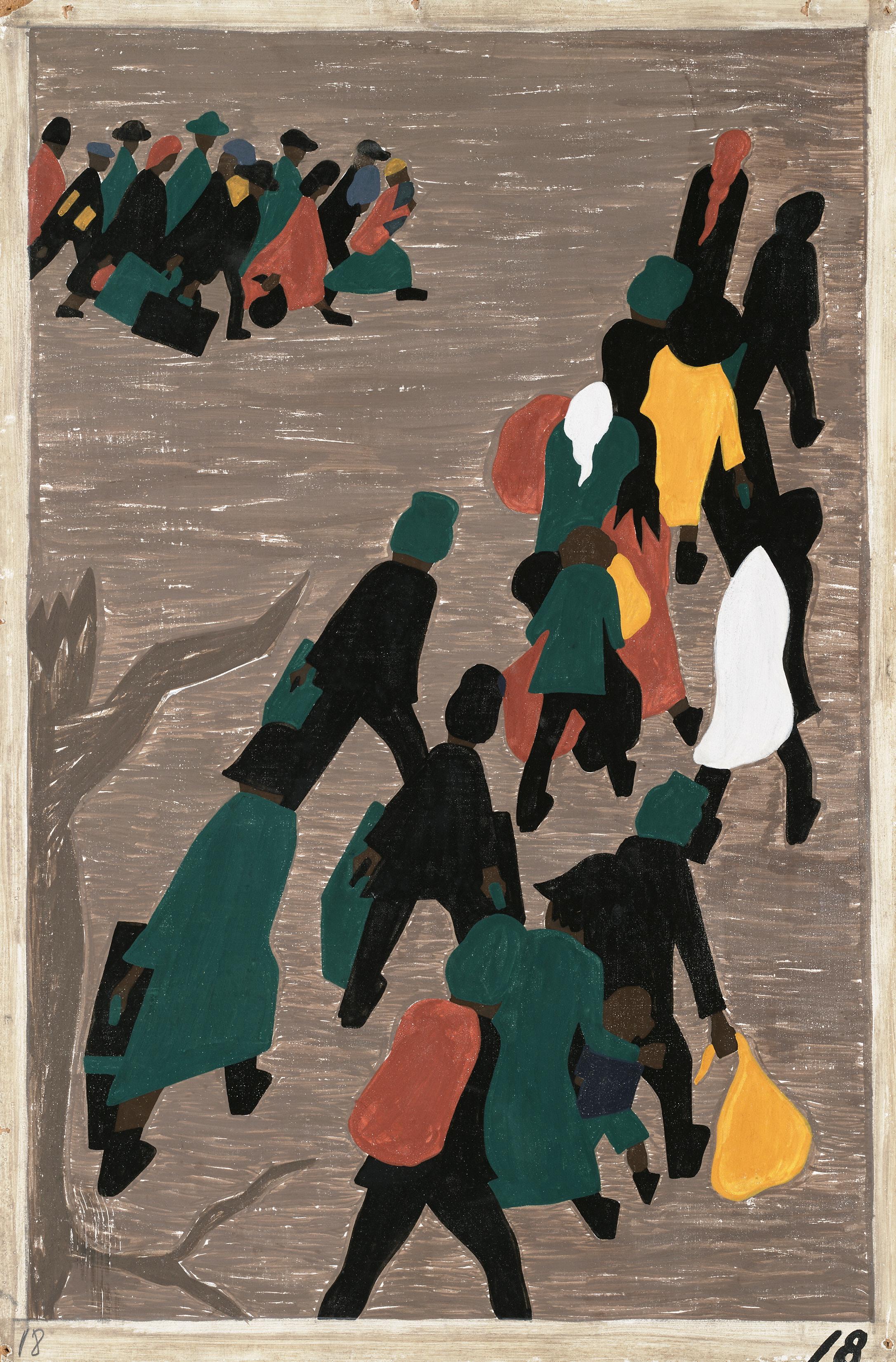 |
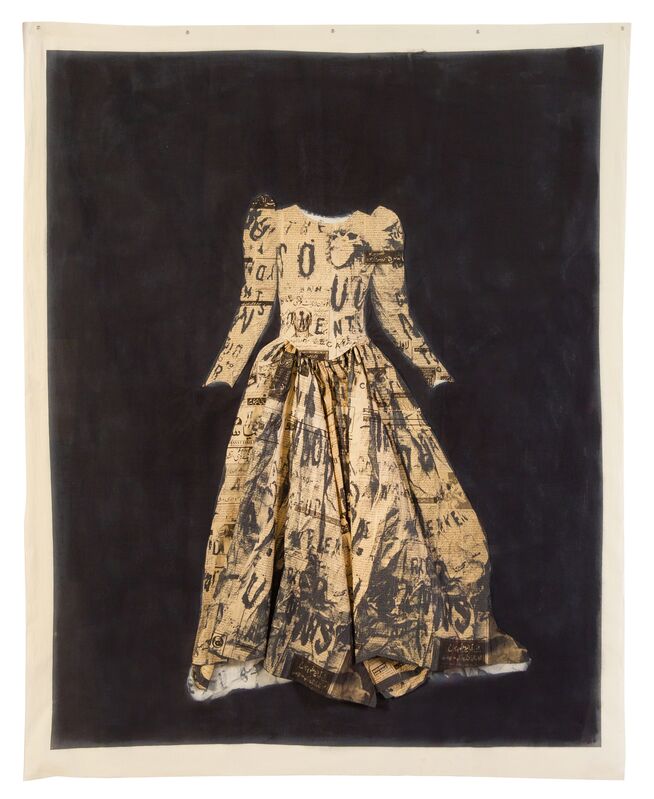
Jacob Lawrence, The migration gained in momentum, 1940-41 Tempera on Board, 12" x 18" |
TEXTURE
We call an object's surface qualities its texture. Ask yourself is it matte, shiny, smooth, rough, jagged etc. Texture can be tactile (physical) like a Van Gogh painting seen in person, where Van Gogh's use of impasto (thick, pasty paint) gives the painting roughness that you could feel with your hand (if the museum guard stepped out) or visual, like the photograph of the Van Gogh painting, with its highly obvious brushmarks even on the smooth photopaper.
 | ||
Meret Oppenheim, Object (luncheon in Fur), 1936, photo MOMA
|

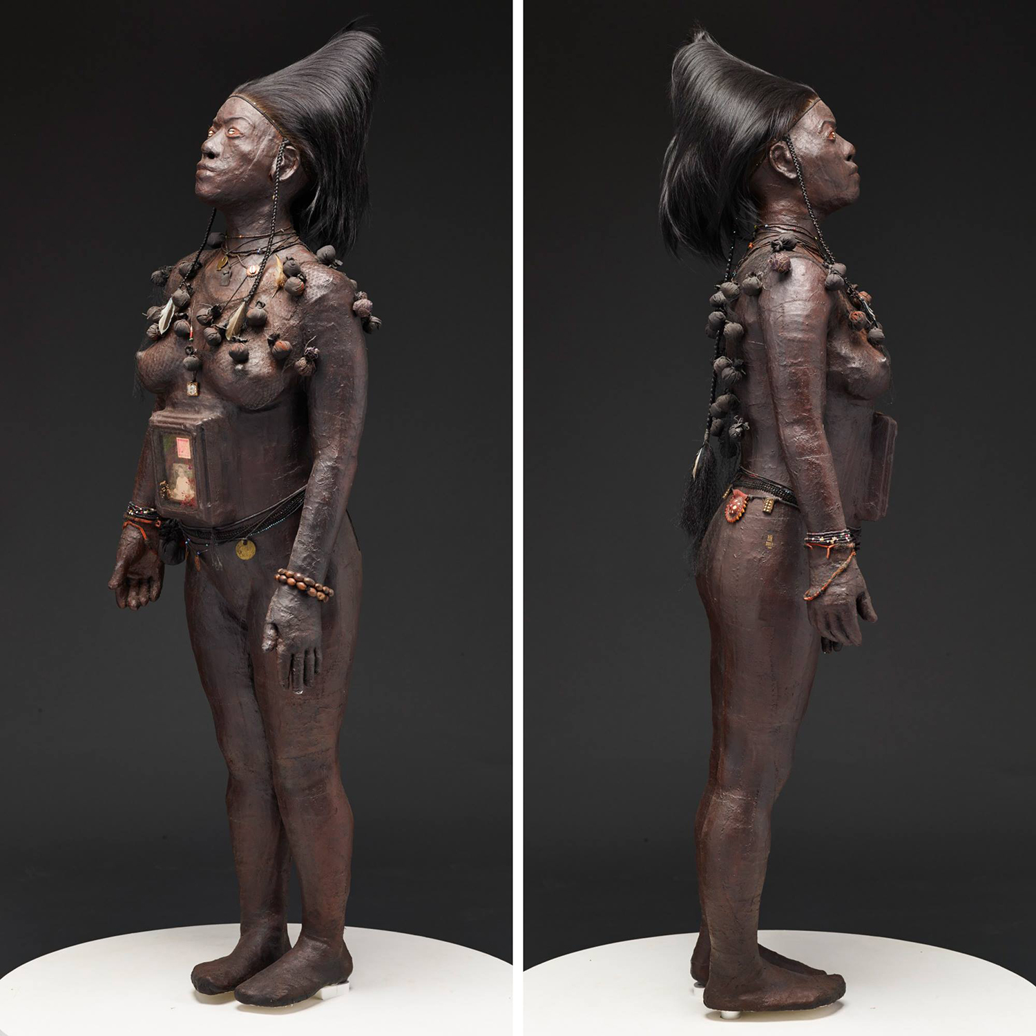 |
| Renee Stout, Fetish #2, 1988, mixed media, plaster body cast, 64" |
COMPOSITION. Qell, now that's a long conversation. For now, I'll just leave it here: artists make choices about how to position and deploy the elements to make/compose their works. Consciously and subconsciously, the principles guide their decisions about how to use the elements to make pleasing or otherwise affecting works.
The Principles of Art/Design
The elements are the components of a work, and the principles are the guidelines artists follow in different ways as they use those elements. The principles help determine how artists arrange visual elements to create interest, mood, and meaning. These principles control the overall effect on viewers, and the ways they perceive meaning.
BALANCE
Balance refers to the appearance of equilibrium in a two- or three-dimensional artwork. Artists balance their work symmetrically (rarely), asymmetrically, or radially, by including elements of varying visual or conceptual weight. Relying on the laws of physics can help you to balance a work; a small object at the edge of the work can balance a large object at the center, a small dark object appears heavier, and will balance a larger light object. Artists use balance to create feelings of anxiety, peace, tension, etc.
 | |
|
 |
| Jeff Wall, Sudden Gust of Wind (after Hokusai) 1993 photograph When I was making A Sudden Gust of Wind I knew I wanted to show how the air could carry the papers. Hokusai had already solved some of these problems. If you analyse his composition, you realise that many of the little pieces of paper coincided with very important points of the rectangle. He composed something that had a feel of the accidental. It was not accidental, but he knew how to make it look that way. I thought that the only way to achieve that was to first create chance situations, to create a lot of movement and then just have a lot of materials to edit. So we created a way a lot of paper could be moved in the air and then tried to think of both the rectangle and the invisible air current in three dimensions. As the papers move in depth, they move away from us and get smaller. I just worked hard on it and tried to compose. There is no guide, its just a feeling, a sense of real, how things are really are or would be . _Jeff Wall |
 |
Jan Vermeer, Woman Holding a Balance, 1665 photo wikipaintings
valuable resource on this painting at the national gallery. here.
|
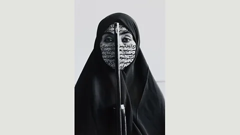 |
| Shirin Neshat, Rebellious Silence, 1994, photograph. "“Every image,” Neshat tells me, as she prepares for the opening of the first major display of her work on the west coast of America, “is symbolic of a certain idea, of a certain type of thinking, a certain ideology. And to me, that image is a very ideological image in the way that it embodies contradictions… it’s a very loaded image. Because it has issues of feminism, religion, fanaticism – you know, religious fervour – and criminality. So it has all these three elements, and they are all moving in different directions. I feel that the way I approach my photography is in that conceptual way. It’s not just like a snapshot, it’s like how do you build layers of meanings and intentions that could have multiple interpretations?”source |
PATTERN:
We call the repetition of an element in an image a pattern. Artists create exact or varied patterns, to different effect.
 |
| Julie Heffernan, Study for Self Portrait in Need of Perpetual Help, 2009 28" x 22" oil on canvas |
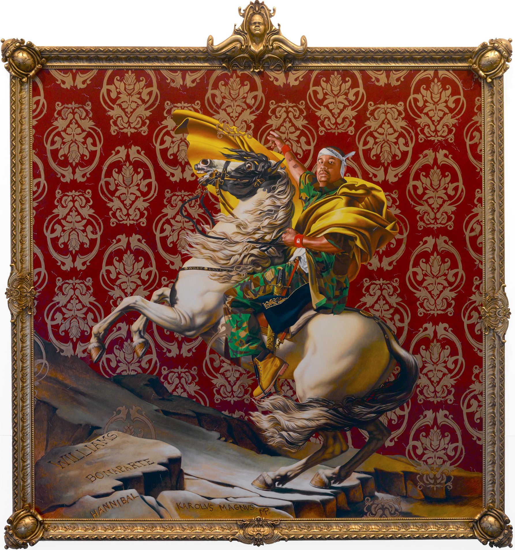 |
| Kehinde Wiley, Napoleon Leading the Troops over the Alps, 2005, oil on canvas, 108 x 108" |
 |
| Michelangelo da Caravaggio, The Incredulity of St. Thomas, 1601 |
EMPHASIS or DOMINANCE
my favorite word: COMPOSITION
-->
Artists give certain elements or areas of their images more power than others, drawing the viewers gaze to a specific space, action, or concept. They use various tools (lines of particular direction, the gaze of persons pictured, contrast, scale, etc) to achieve the emphasis
REPETITION
Artists use repetition to create unity in their works. Repetition without VARIETY tends to generate static images, repetition combined with Variety tends to create harmonious ones.
 |
| Michelangelo Buonarotti, Sistine Chapel Ceiling, 1508-1512 |
UNITY/HARMONY
The Combination of similar or related elements-- colors, shapes, lines,objects, often via a degree of repetition, often creates a visually pleasing affect. Unity and Harmony give a sense of intentionality and completeness.
_-_WGA13024.jpg) |
| Limbourg Brothers, Trés Riches Heures du Duc De Barry, Juillet, ~1414 |
CONTRAST
Contrast in Color, Direction, Value, Content etc all create interest in a work of art and prevent it from becoming dull or lifeless. Artists seek to balance Repetition, Unity, and Harmony with Contrast to enliven their images.
.
 |
| Wangechi Mutu, Yo Mama, 2006, MOMA "In Yo Mama (2006), the heroine—modeled after Funmilayo Anikulapo-Kuti, the Nigerian feminist and mother of the legendary Afrobeat musician Fela Kuti—embodies the role of Eve, the biblical first woman. She stands atop a beheaded snake, piercing its severed head with the stiletto heel of her boot. The serpent’s coiling body unravels placidly through the pink outer space, holding the two panels of the collage together as its tail wraps around a distant planet. Mutu’s cosmic composition utilizes the potent symbol of the snake in all its richness: the cunning creature associated with Eve’s damnation morphs into a mythical, celestial being whose dead body bridges two planets, while its wounded phallic form evokes oppressive masculinity. In Mutu’s retelling of this foundational tale, Eve defeats the snake and emerges victorious, taking control of her own story." From the MOMA website |
my favorite word: COMPOSITION
Comments
Post a Comment